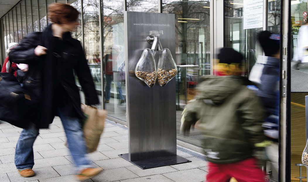
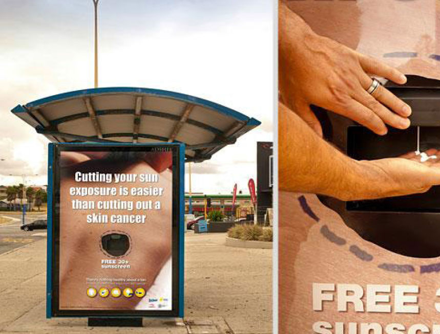
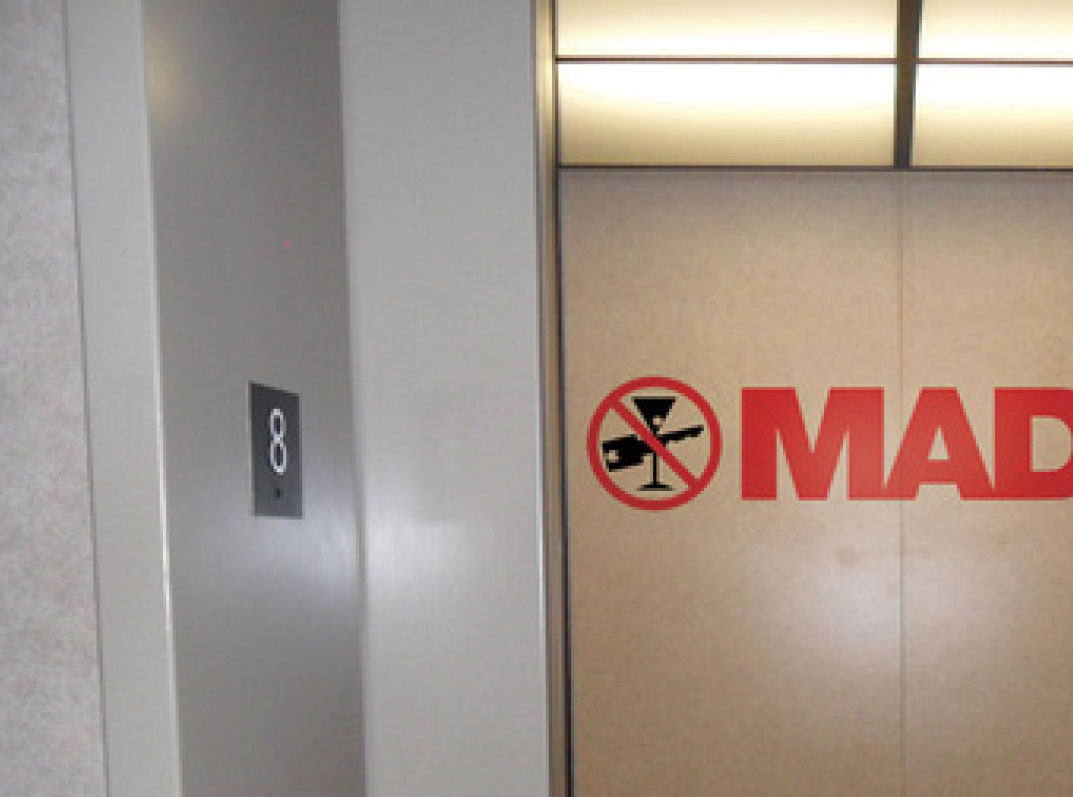
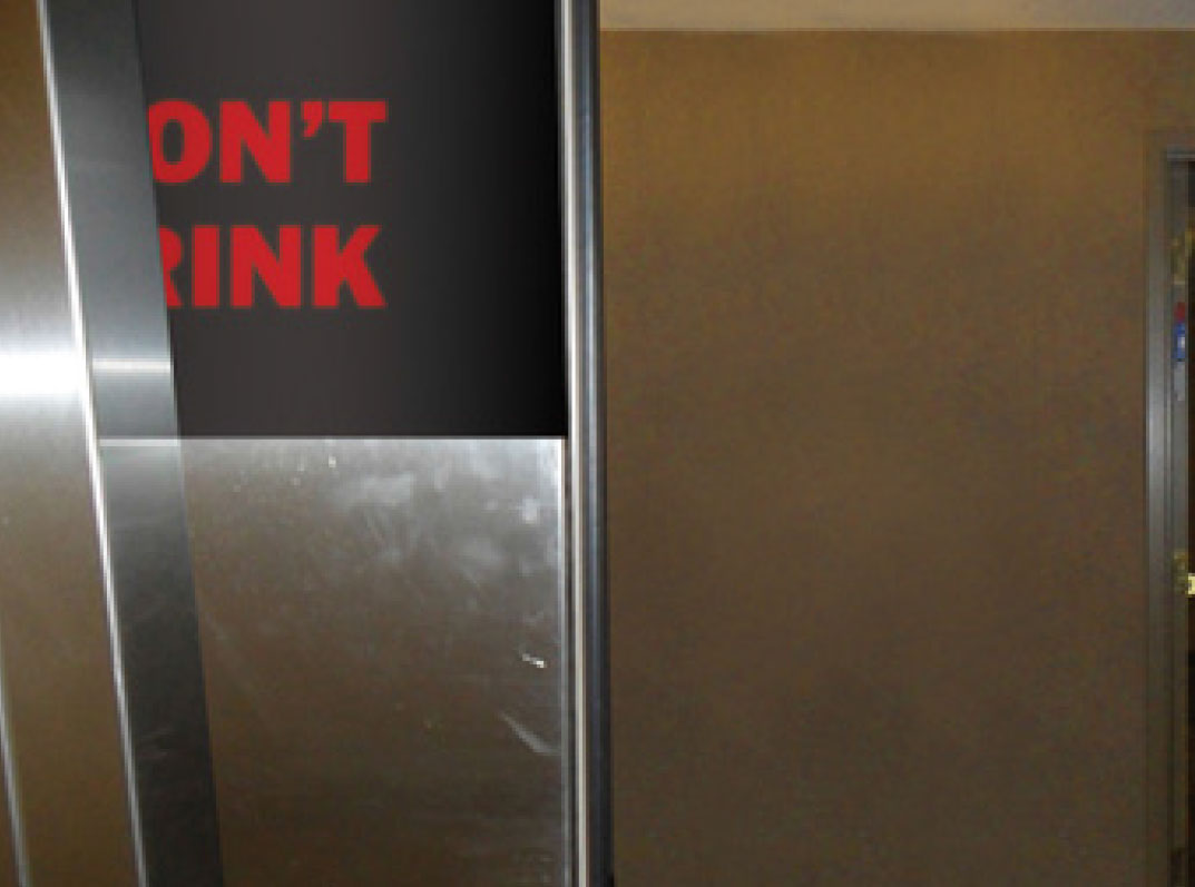
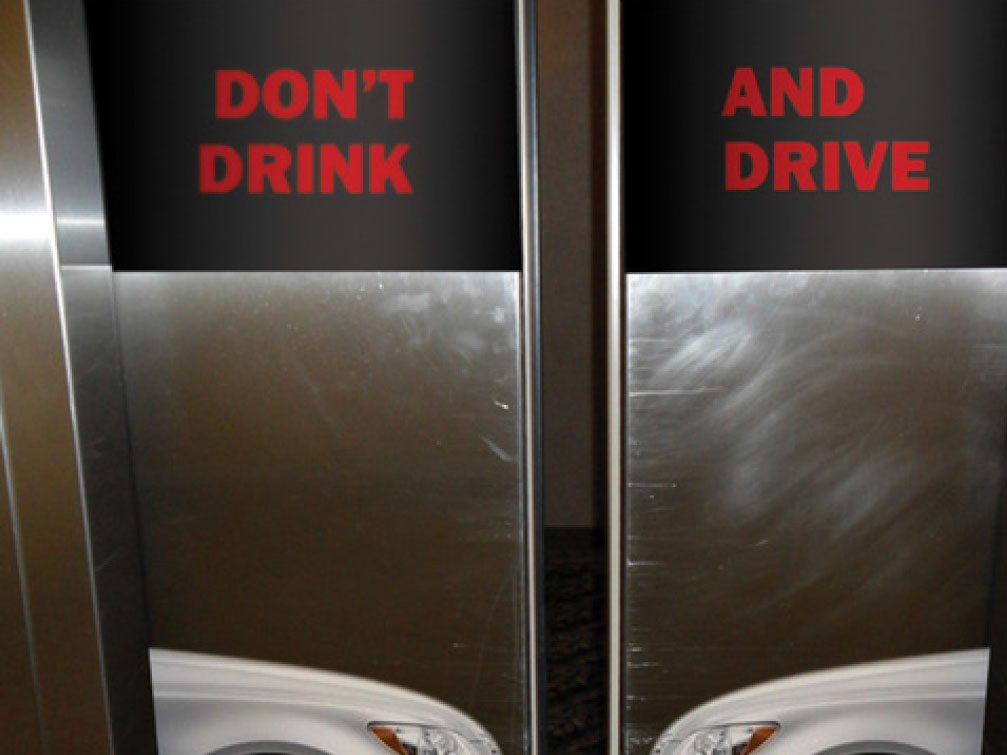
From Elon Journal of Undergraduate Research in Communications VOL. 5 NO. 1The Efficacy of Guerrilla Advertising on Public Health IssuesSubscale of Sensory InvolvementIn educational settings, teachers and professors often encourage learning through multiple senses. For example, during a lecture, students would be encouraged to listen to the teachings, view the board for visual examples, and take notes on a sheet of paper. In mainstream thinking, involving the haptic (feeling), auditory and visual senses to digest information better improves memory and learning. This idea is supported by Shams and Seitz’ assertion that multisensory training protocols produce greater and more efficient learning (2008). It is valid to assume, then, that this multisensory theory is applicable to disseminating information through advertising. In an international quantitative and qualitative study, Millward Brown and its associates explored the brand sensory experience and found that 99% of current brand communications focus only on auditory and visual stimuli, whereas, 75% of human emotions are noted to be generated through smell (Lindstrom 85). This shows that current traditional advertising does not resonate as fully with its audience as it could, and that guerrilla advertising fills a hole for that multi-sensory experience. Lindstrom states, “The general rule of thumb is that the more senses a brand appeals to, the stronger the message will be perceived” (86). Using the examples of the signature Rolls Royce smell and the distinct crunch sound of Kellogg’s Rice Crispies, Lindstrom emphasizes the role that senses play in a consumer’s increased perception and improved experience of a brand (85). Based on the studies above, a sensory scale was created measuring whether an advertisement appeal to visual (sight), auditory (sound), haptic (feel), gustatory (taste), or olfactory (smell) senses. If each of these senses is vital to an advertisement’s function and message, the advertisement scores one point each, except for the olfactory one. Given that 75% of emotions are generated through the olfactory sense, or smell, it is assigned two points instead. If any of these senses is used purely circumstantially or environmentally, not adding any function or message to the advertisement, the advertisement receives no point value for that sense. Subscale of Environmental CircumstancesThe last scale is created to analyze how much impact the environment has on an guerrilla advertisement. Razzaq, Ozanne and Fortin considered that since the purpose of guerrilla advertising is to attract attention and surprise the public, the environmental circumstances in which the advertisement is seen plays a large role in behavioral responses (2). More specifically, their study involves the different responses in a “captive” environment, such as a bathroom, public transit stations, etc., and an “open” environment, such as outdoors, shopping malls, etc. The results from their experiment on the campus of a large university in New Zealand supports the hypothesis that a captive environment is a more effective and behavior evoking method of promotional or advertisement material distribution (6). On the environment scale, an advertisement garners one point if it is located and interacted with in a captive environment. If the advertisement exists in a captive environment and exists dependently and purposefully because of that environment, it receives one point. For example, an advertisement in a subway station will receive one point because the individual who sees it is captive in that environment until his or her purpose in that environment is fulfilled (ie: until the train arrives and then actually boarding it). If an advertisement exists in an open environment and holds no dependency on the existence of that environment, it will receive no point in this category. For example, a guerrilla advertisement on the side of a bus would receive no point because individuals who see it are not bound by that environment in any functional way, unlike those in the subway station. Advertisements analyzedDue to their unique channels and creative tactics, the following three advertisements were selected as a sample of non-traditional and guerrilla advertising of health and safety concerns that the public is generally in agreement about. “The Smoker’s Lung”: In a guerrilla advertisement for the AOK, Germany’s largest health insurance company, a set of hollow glass lungs is placed in front of and inside public buildings such as the AOK headquarters, hospitals, swimming pools and restaurants in Southern Germany. It is filled with cigarette stubs and has an ashtray on the top portion, along with a website where people can find out more information about quitting smoking. The website is called “I will become a non-smoker.” (Refer to Advertisement 1 in the Appendix.) “Cut Out”: SunSmart Cancer Council of Western Australia employed a guerrilla advertisement in 2011 on the side of a bus stop. The ad depicts a person’s back with a large cut out in it that looks surgical and is actually a 30+ SPF sunscreen dispenser. The headline reads, “Cutting your sun exposure is easier than cutting out a skin cancer.” The body copy reads, “Free 30+ sunscreen. There is nothing healthy about a tan. Protect yourself 5 ways from skin cancer.” There are five small icons below the text that give examples of ways to cut sun exposure. (Refer to Advertisement 2 in the Appendix.) “Crash”: In a guerrilla advertisement for Mothers Against Drunk Driving (MADD), an elevator is used to discourage drunk driving. When looking into the open elevator from outside, one can see the letters “MADD” and a slashed circle symbol with a martini glass and a car key in it on the far wall of the elevator. Once inside the elevator, the viewer sees the fronts of two cars on opposing elevator doors that collide when the doors shut. The headline on the inside of the elevator doors when shut reads, “Don’t drink and drive.” (Refer to Advertisement 3 in the Appendix.) Discouraging smoking, encouraging sunscreen use, and preventing drunk driving are all initiatives that find agreeable resonance with society and individuals. While public health concerns and advertisements about other matters such as flu shots, birth control, or breastfeeding exist as well, these matters are more subjective and are met with differing or dissenting opinions, making them less viable options to explore objectively with the RIA Scale. These three specific public health issues were also chosen because they fit into the fear appeal landscape, whereas flu shots or breastfeeding do not find strong resonance there. Findings and AnalysisUsing the nine items in the RIA Scale, the author tallied the points each of the three advertisements garnered, as shown in Table 1. The total score measures the advertisement’s perceived efficacy. Table 1: RIA Scale advertisement analysis
Note: Each question garners one point while the question on Olfactory does two points. The maximum score for the RIA scale is 10 points. Coding Analysis“The Smoker’s Lung” garnered the highest score of eight points. This advertisement aroused fear because of the vivid imagery between smoking and the effects on the lungs. The consequences are assumed to be lung cancer and poor health if smoking continues, which can be life-threatening. Two proposed solutions are readily available: an individual can put out his or her cigarette in the ashtray and/or visit the website to learn more about stopping smoking. The advertisement is obviously visual but lacks an auditory component. This advertisement targets smokers, so their interactions with the advertisement most likely include physical smoking of a cigarette, which incorporates the haptic sense (physically having to feel the cigarette while stubbing it out), the gustatory sense (the taste of a cigarette) and especially the olfactory sense (the distinct smell of the cigarette). Lastly, it is not in a captive environment, but rather in an open one on the side of a building. These are all reasons that it garnered eight points on the RIA Scale. “Cut Out” aroused fear with the headline that mentions skin cancer and the strong visual of a surgical incision on the body. If an individual does not cut sun exposure, the implied consequence is skin cancer, and the proposed solution is using sunscreen that is free and readily available. This advertising is visual, but also haptic (the feel of putting sunscreen on the skin) and olfactory (the distinct smell of sunscreen). Lastly, it is not in a captive environment, but rather in an open one on the side of a bus stop. This advertisement scored seven points on the RIA Scale. “Crash” arouses fear because of the imagery of the car crash physically happening as the elevator doors shut. A head-on collision simulated by the elevator would lead to an arrest for a DUI, personal injuries, or even death. The advertisement is visual, auditory and haptic because an individual would see the advertisement while pushing the elevator button to close the doors and hear the closing sound as it happens. Lastly, the advertisement exists in an elevator an individual rides in, which is a captive environment. This advertisement scored six points on the RIA Scale. DiscussionDeparting from the exploration of brand image, favorable opinions, and likelihood to purchase that is common with commercial advertising, the RIA scale focuses on assessing the perceived impact and resonance of the public health advertisement based upon fear appeal, sensory involvement, and environmental circumstances. The three selected public health guerrilla advertisements showed a difference in their RIA scores, which is explained here. “The Smoker’s Lung,” while seemingly ordinary at first glance, is extremely powerful. While unappealing or dull to non-smokers, it specifically targets smokers in a multi-sensory way that involves four out of the five senses, making it the most stimulating of the three ads chosen. On the other hand, “Cut Out” incorporates three senses (olfactory included) in its use of the sunscreen dispenser. It is important to recognize that this advertisement that could have been just a normal print advertisement on the side of the bus stop instead effectively used the sensory involvement to create an interactive and more memorable experience. While “Crash” incorporates three senses into the advertisement, its lack of the olfactory sense (smell) leads to fewer points on the RIA scale. The more senses involved in the advertising experience, the more interactive it is presumed to be, which in turn leads to a more memorable and resonating experience. This assertion can be tested with advertisements in other areas than public health. The fear appeal aspect of the RIA scale is specific to the public health industry because it incorporates very real, impending, and extreme fears and consequences. “The Smoker’s Lung” has a clear fear appeal because the advertisement vividly shows what smoking will bring to the smoker: carcinogens that fill a glass lung and accompanying health problems. It proposes an easy and immediate solution of stubbing out the cigarette in the provided ashtray and/or visiting the website. This advertisement is a great example of a comprehensive fear appeal. Similarly, “Cut Out” uses stark language and imagery about the possibility of skin cancer to arouse fear and provides an immediate solution of using the sunscreen offered. “Crash” utilizes fear appeal, but less comprehensively because while the fear is aroused and its level is extreme, the solution requires a delayed reaction that is needed later when the viewer is faced with the decision of whether or not to drink and drive. Fear appeals can be polarizing, alarming or even ostracizing, so they must be used appropriately and responsibly. In the public health area, the fear appeal is most successful when the advertisement is comprehensive, arouses an extreme fear, and seeks to alleviate fear immediately, which in turn can influence the viewer’s mindset and future behavior. This is why “The Smoker’s Lung” and “Cut Out” are considered more impactful and resonating than “Crash.” Both “The Smoker’s Lung” and “Cut Out” exist in an open environment, which weakens their environmental circumstances. “Crash,” on the other hand, makes good use of a captive environment in the execution of the advertisement as well as its location. People riding in the elevator is vital to the existence and presentation of the advertisement. For a bigger impact of “The Smoker’s Lung,” for example, it could be placed in a captive environment, such as a smoker’s room at the airport. The environmental circumstances in which the public interacts with advertisements are extremely important in determining their resonance with viewers. “The Smoker’s Lung” has the highest score, 8 out of a possible 10 points, on the RIA Scale, which implies that it is the most interactive and resonating advertisement studied. “Cut Out” received the median score of 7 points, while “Crash” received the lowest score of six points. It is assumed that a higher number of points received correlates positively to implied efficacy, resonance, and impact.Continued on Next Page » Suggested Reading from Inquiries Journal
Inquiries Journal provides undergraduate and graduate students around the world a platform for the wide dissemination of academic work over a range of core disciplines. Representing the work of students from hundreds of institutions around the globe, Inquiries Journal's large database of academic articles is completely free. Learn more | Blog | Submit Latest in Business & Communications |

